
Neumorphism is a trending design language that combines the classic principles of successful design along with innovation and technology.
Neumorphism UI is an elegant and clean UI Kit for those who want to develop websites or web apps using Neumorphism Design. It uses the power of the Twitter Bootstrap 5 framework and it has been written in SASS.
The UI Kit is open source, and it makes use of Font Awesome icons, but you can also change these to suit your own preferences.
How to use it:
1. Import the compiled stylesheet into your document.
<link href="./dist/css/style.css" rel="stylesheet" />
2. Customize the UI Kit by overriding the default variables in the /scss/_variable.scss/.
// Variables - here you can change this global values of the UI Kit
$font-family-sans-serif: "Roboto",
sans-serif !default;
$font-family-raleway: "Raleway",
sans-serif;

/*Theme Colors*/
// $headingtext: #3e4555;
// $bodytext: #8d97ad;
// $themecolor: #f869f9;
// $themecolor-alt: #2F3437;
// $themecolor-dark: #403e72;
// $themecolor-dark-alt: #464479;

/*bootstrap Color*/
$primary: #7367f0;
$info: #39c2fa;
$dark: #313448;
$secondary: #f8f9fa;
$muted: #44476a;
$success: #42b983;
$danger: #d63384;

/*Light colors*/
$light-info: #34d9da;

// Gray color
$white: #fff !default;
$gray-100: #f5f4f4 !default;
$gray-200: #fcfcfc !default;
$gray-300: #eeeeee !default;
$gray-400: #d5d5d5 !default;
$gray-500: #e1e1e1 !default;
$gray-600: #e9ecef !default;
$gray-700: #b9b9c3 !default;
$gray-800: #6c757d !default;
$gray-900: #212529 !default;
$black: #000 !default;
// scss-docs-end gray-color-variables

// fusv-disable
// scss-docs-start gray-colors-map
$grays: ("100": $gray-100,
  "200": $gray-200,
  "300": $gray-300,
  "400": $gray-400,
  "500": $gray-500,
  "600": $gray-600,
  "700": $gray-700,
  "800": $gray-800,
  "900": $gray-900,
) !default;

/*Normal Color*/
$light: $gray-600;
$white: #ffffff;
$red: #fb3a3a;
$yellow: #fed700;
$purple: #05998b;
$blue: #02bec9;
$megna: #1dc8cd;
$orange: #ff6a5b;
/*Extra Variable*/

// Body Custom settings
$text-muted: $muted !default;
$body-bg: #e6e7ee !default;
$body-color: #44476a !default;
$shadow-in: inset 2px 2px 5px #b8b9be,
inset -3px -3px 7px #fff;
$shadow-out: 3px 3px 6px #b8b9be,
-3px -3px 6px #fff;

/*font-sizes*/
$font-sizes: (1: 10px,
  2: 12px,
  3: 14px,
  4: 16px,
  5: 18px,
  6: 20px,
  7: 24px,
  8: 30px,
  9: 36px,
  10: 40px,
  11: 46px,
  12: 50px,
) !default;

$font-size-root: null !default;
$font-size-base: 1rem !default; // Assumes the browser default, typically `15px`
$font-size-sm: 0.813rem !default;
$font-size-lg: 1.125rem !default;

// Font-Weight
$font-weight-lighter: 300 !default;
$font-weight-light: 400 !default;
$font-weight-normal: 500 !default;
$font-weight-bold: 600 !default;
$font-weight-bolder: 700 !default;

$font-weight-base: $font-weight-light !default;

// Grid
$grid-gutter-width: 24px !default;

// Container Custom settings
$container-max-widths: (sm: 540px,
  md: 720px,
  lg: 960px,
  xl: 1140px,
) !default;
$container-padding-x: 15px !default;

// scss-docs-start border-variables
$border-width: 1px !default;
$border-widths: (1: 1px,
  2: 2px,
  3: 3px,
  4: 4px,
  5: 5px,
) !default;

$border-color: #d1d9e6 !default;

// Input
$input-border-width: 0px !default;
$input-border-radius: 0px !default;

// Card
$card-bg: transparent !default;
$card-spacer-y: 24px !default;
$card-spacer-x: 24px !default;
$card-border-radius: 0.55rem !default;

// Negative margin
$enable-negative-margins: true !default;

// Heading
$headings-font-weight: 600 !default;
$headings-color: #44476a;

// Badge
$badge-padding-y: 0.65em !default;
$badge-padding-x: 1.4em !default;

// Accordion
$accordion-border-radius: 6px !default;
$accordion-border-width: 0 !default;
$accordion-button-bg: transparent !default;
$accordion-bg: transparent !default;
$accordion-button-active-bg: transparent !default;
$accordion-button-active-color: #44476a !default;

$accordion-icon-color: $muted !default;
$accordion-icon-active-color: $muted !default;
$accordion-icon-transition: transform .5s ease-in-out !default;

$accordion-icon-width: 0.8rem !default;
$accordion-icon-transform: rotate(-315deg) !default;
$accordion-button-icon: url("../../dist/images/plus2.svg") !default;
$accordion-button-active-icon: url("../../dist/images/plus2.svg") !default;


// Carousel
$carousel-control-color: $dark !default;
$carousel-indicator-active-bg:       $dark !default;
$carousel-indicator-opacity:         .1 !default;
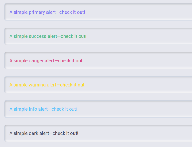
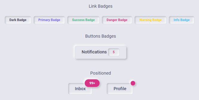
Previews:


The post Neumorphic UI Kit For Bootstrap 5 – Neumorphism UI appeared first on CSS Script.